Introduction
As with any aspect of the design, website navigation is the primary source of the user's experience with the site. It can either be someone's first encounter with a brand or take the user straight into buying mode upon returning to a website. In either case, navigation determines how quickly and easily the user finds what is sought after. If it's clunky, crowded, or simply confusing, the visitor does not remain on the site. They will bounce, they will churn, and they will never convert. Harsh? Not really—it's the digital reality.
Guess what? Most businesses don't even realize how much money they're missing because of poor navigation. They're obsessing over landing pages, spending tremendous amounts in the area of SEO, changing button colors to the nth degree, yet not concerning themselves with the one thing that actually is touched by every user: the different pathways to value. A seamless, intuitive navigation system aligned with goals is not just a wish but rather a conversion multiplier in plain sight. This guide breaks everything down-methods in thinking and revamping your website navigation, not to make it "better" but to convert it. From proven layout patterns and audit strategies to visual hierarchy and real-world examples, this playbook will be built on user psychology, behavioral data, and conversion science. If you're serious about converting more visitors into buyers, it starts with how they find their way.
What is Website Navigation and How it Affect User Experience?
Website navigation is the way visitors see what business offers, where to find it, and how to act on it—signing up, buying, or contacting you. You describe navigation in the simplest sense as the pathway of people from point A (landing) through to point B (conversion). And when that map is broken or unclear, the journey stops cold. But very much like getting from one page to another, the actual user experience is about how it feels when doing it. Is it easy? Is it obvious? Does it flow naturally, or do they have to stop and think? The main thing with user experience is how much cognitive ease is present. If your navigation induces friction, confusion, or overwhelm, you introduce a subtle element of resistance that allows trust and engagement to be chipped away from underneath. They are great navigation, feel so unknown, and become like a great magic rope that draws people without them ever even noticing it. Let’s look at the breakdown of all the elements constituting the whole website navigation.
Key Elements of Website Navigation
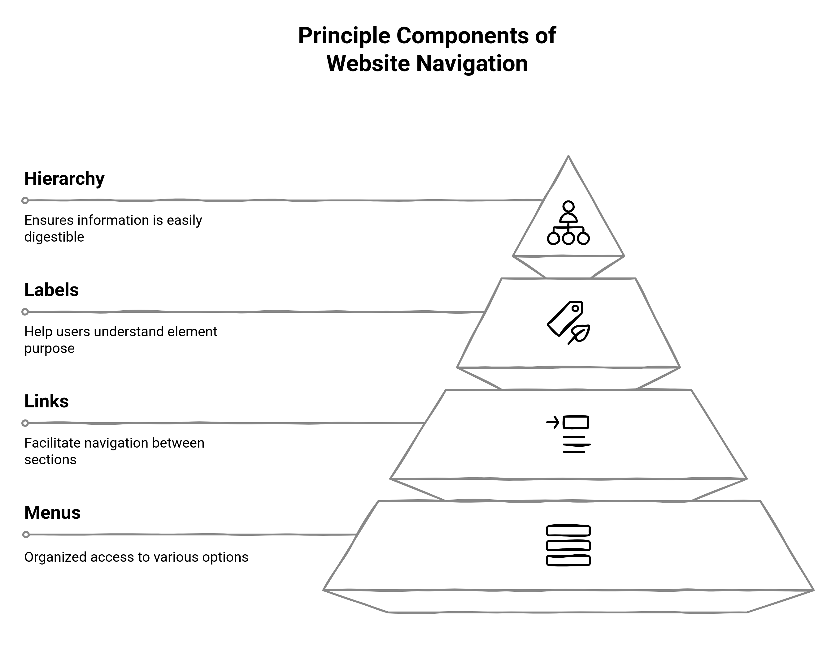
- Menus: Most often, such menus are placed either on the front or side of pages and hold links grouped and categorized under the most significant sections of your site, and are indicative of a high-level structure of what's available.
- Links: These are the connections in your website, whereby you can move to another page or section on your site. This includes everything from call-to-action buttons to in-text hyperlinks.
- Labels: These are your names or phrases used to describe each menu item or link. Clear and action-oriented labels (like "Get a Demo" or "Pricing") are far better than vague ones ("Solutions" or "More").
- Hierarchy: That means how your content dramatically organizes what is primary, secondary, and buried (or, in some cases, highlighted). It has a good hierarchy that reflects more user priorities than just structural priority.
When these elements are designed intentionally and in concert, then navigation is smooth. Internal navigation gives rise to higher engagement, lower bounce rates, and strong conversions. This is not just good for UX but also a business consideration.
The Link Between Navigation and a Seamless Digital Experience
Navigating a website usually differentiates a boring visit from a very good experience that builds trust. Users should not be whispered into their homepage and fantasize over, "Let me first take a look at this menu," as they are individualized and individualized toward how much time should be spent figuring out where to go, which is also momentous. Navigation mechanisms typically work at a level that does not even afford brief notice; on the contrary, they tend to sever entirely.
It is all about cognitive load reduction, which means it reduces the effort required for users to understand, decide, and act. The more intuitive your navigation system is, the more it functions as an echoing guide; inward pointing them to their solutions, engaging them in the brand's voice, and reassuring them of their understanding of what they need. When navigation is awkward and chaotic, however, its opposite message is sent: disorganization, distraction, and disregard for the user's time.
Smart navigation anticipates intent and supports it. Every decision you make, from menu layout to link placement, completes the tapestry of emotional-functional quality in that experience. Simple doesn't only mean users can find and access what they need, it also allows them to do it confidently.
Influence of Website Navigation on Conversion Rates
Excellent website navigation not only organizes the content but also affects the behavior, decision-making, and consequent conversion of the visitors. When users can quickly access what they were searching for, they engage better with your value proposition, further explore, and eventually take meaningful action. On the contrary, ambiguous or counterintuitive navigation creates apprehension. In an age of scarce attention, such hesitation usually ends in exit. A well-defined navigation path assures a user's feeling of comfort; it reduces the mental effort exerted in exploring your site while creating inertia for clicks from one page to another. The psychology of ease comes into play here: with lesser friction, users are likely to trust the brand, remain longer, and convert. Confusing pathways, inconsistent labels, or too many choices can disrupt this flow, and once that trust breaks, recovery is hard. Let us consider commonly encountered circumstances in which bad navigation directly kills conversions:
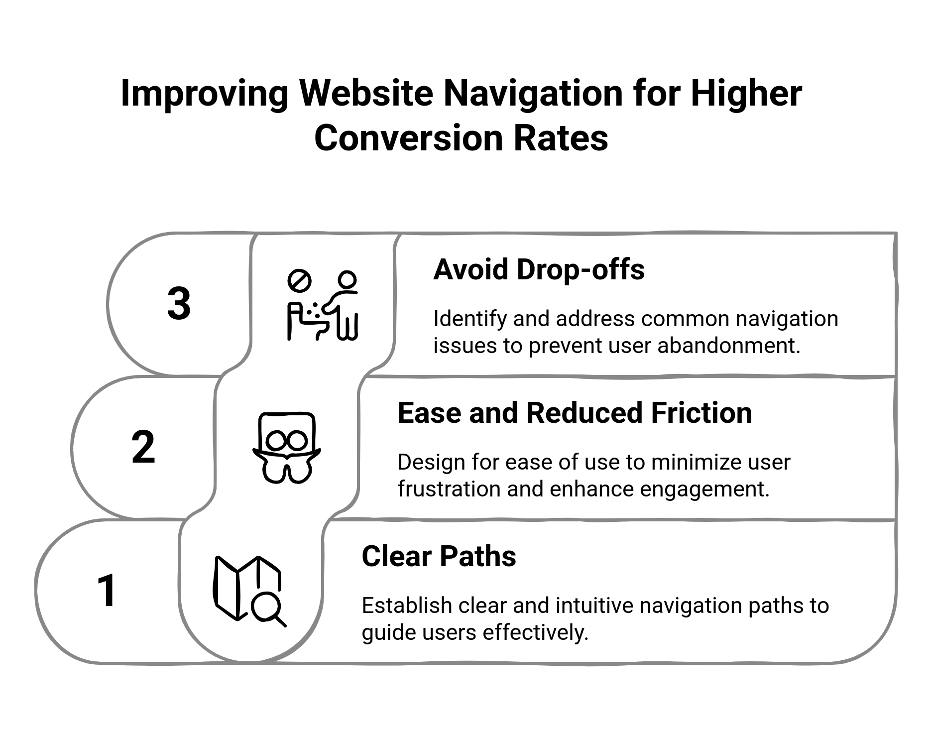
Common Navigation Mistakes That Cause Drop-Offs
Let's have a look at some of the most common navigation mistakes that cause drop-offs:
Overcluttered Menu
As soon as the visitors are presented with a dozen choices, they begin suffering from decision paralysis. They do not know where to go, and hence they go nowhere at all.
Hidden or Vaguely-Labeled CTAs
If website navigation does not make explicit critical actions such as 'Book a Demo' or 'Start Free Trial', you are overworking your users to become your customer.
Unclear Terminology and Use of Jargon
Internal terminology leaves the user guessing; words such as "Solutions" or "Resources" leave people in a fog. They want to know what are you're talking about!
Broken or Inconsistent Navigation for Mobile Users
Users tend to flee fast if your mobile experience folds into a poorly spaced hamburger with a dozen missing links. Consistency matters.
The Most Common Layouts for Website Navigation
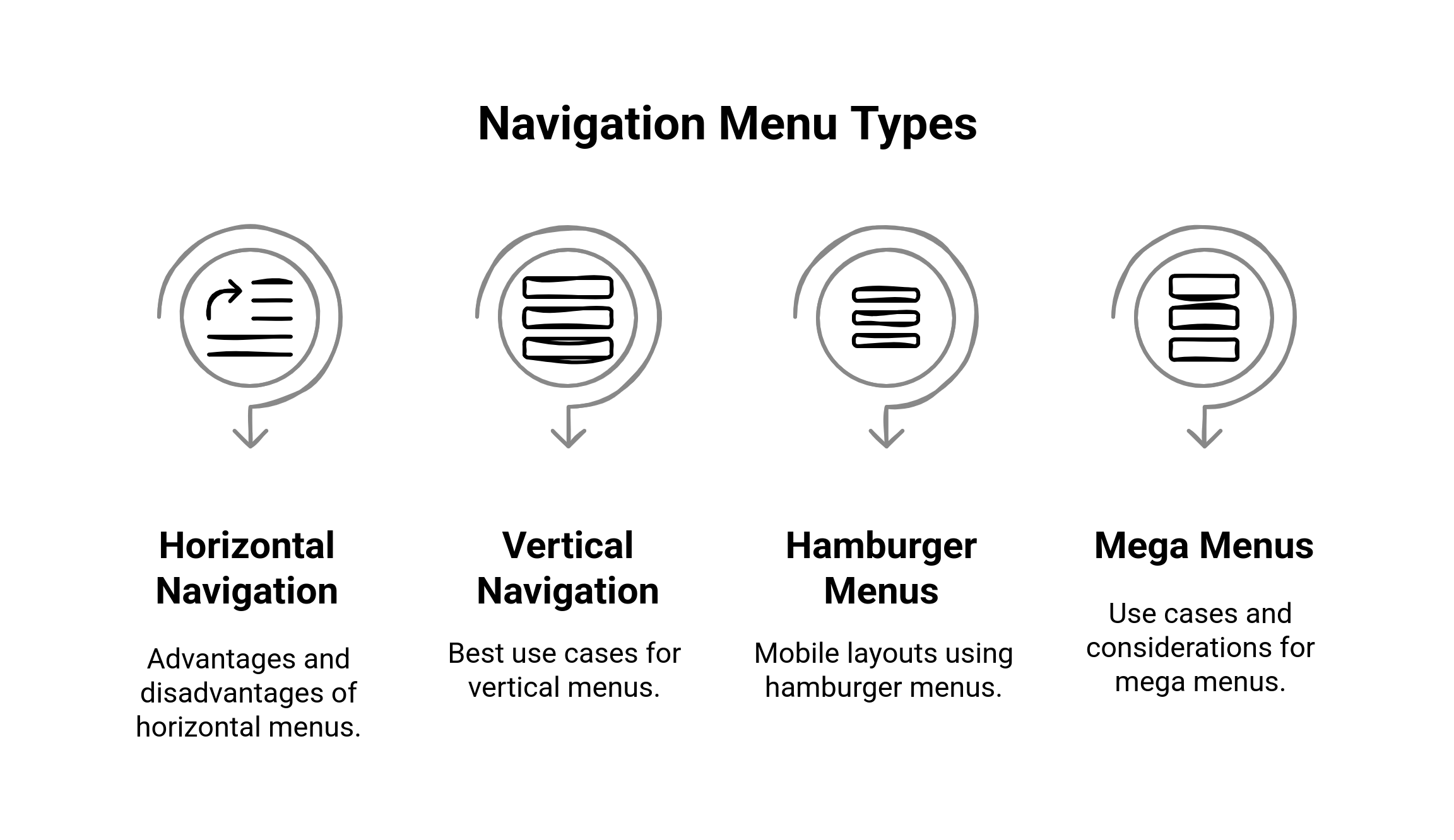
When it comes to choosing the right layout for navigation, it is not just about visual aesthetics, it is about guiding users according to context, device, and behavior. The structure you choose creates the tone of how people explore your website and how fast they reach what matters. Whether designing a site for desktop or mobile, every decision needs to be made with simplicity and strategic clarity. Different cases need other layouts. Some work better with content-heavy websites, while others fit funnel flow to action. The trade-offs of each must be understood and married with the audience's expectations. Here are some common navigation designs, along with when to use them.
Horizontal Navigation
Horizontal navigation-typically on the top edge of the header in the screen-proved to be quite a common feature for most users. It creates intuitive access to information. It balances out the scraps and maintenance of central pieces, such as home, features, pricing, and contact.
Advantages:
Most of the users are familiar with it; it has no learning curve
Keeps above-the-fold content slick and balanced
Great for viewing on both desktop and tablet
Disadvantages:
Cramped space- fits poorly with long menus or complex hierarchies
Can get congested or unresponsive when optimized for mobile usage
Does not scale with larger, rich content-based websites
Vertical and Sidebar Navigation: When It Works Best
Vertical navigation—often used in sidebars—is ideal when depth and hierarchy matter more than breadth. You’ll often see this on e-commerce sites, knowledge bases, or dashboards.
Best for:
Sites with multiple categories or a deep structure
Platforms where users need quick access to tools or settings
Pages where persistent visibility of options is useful
Watch-outs:
Can dominate screen space if not designed responsively
May feel dated or bulky on consumer-facing marketing sites
Needs collapsible logic for clean mobile adaptation
Hamburger Menus and Mobile-First Layouts
The hamburger menu (☰) has become the default for mobile navigation. It’s compact, recognizable, and opens up screen space for content.
Pros:
Keeps mobile interfaces clean and uncluttered
Offers a centralized place for all navigation elements
Works well for simple to moderately complex site structures
Cons:
Can hide important pathways, reducing discoverability
Adds an extra tap before users can start exploring
Needs strong visual cues and quick animation to feel smooth
Pro tip: Avoid hiding critical CTAs behind a hamburger. Combine with sticky buttons for high-intent actions.
Mega Menus vs Dropdowns: Use Cases and Considerations
When you’ve got a lot of options, mega menus and dropdowns help organize them. But they serve different purposes.
Mega Menus:
Expand across the screen to display multiple categories at once
Excellent for e-commerce, enterprise software, or content-heavy sites
Allow for visual elements (icons, images, featured items)
Dropdown Menus:
Simpler, linear sub-navigation
Best for small to mid-sized sites with limited categories
Can get clumsy if nested too deeply or overloaded
Important: Both should be tested rigorously. Poor hover behavior or slow animations can frustrate users, especially on mobile.
Best Practices for Website Menu Structures that Guarantee Conversions
For instance, your website menu is not just a link tree but rather a strategic partner to mold the user behavior. The best of them channel visitors toward value while reducing friction. They don’t just “look clean”—they’re built around user intent, business goals, and conversion logic. And when done right, they work quietly in the background, too. If users are confused as to where to click or by what a specific menu item means, you've already lost them. Proper menu structure doesn't confuse. It informs. Below are time-tested practices for designing navigation that converts, not by shoving, but by guiding.
Designing Intuitive and Goal-Oriented Menus
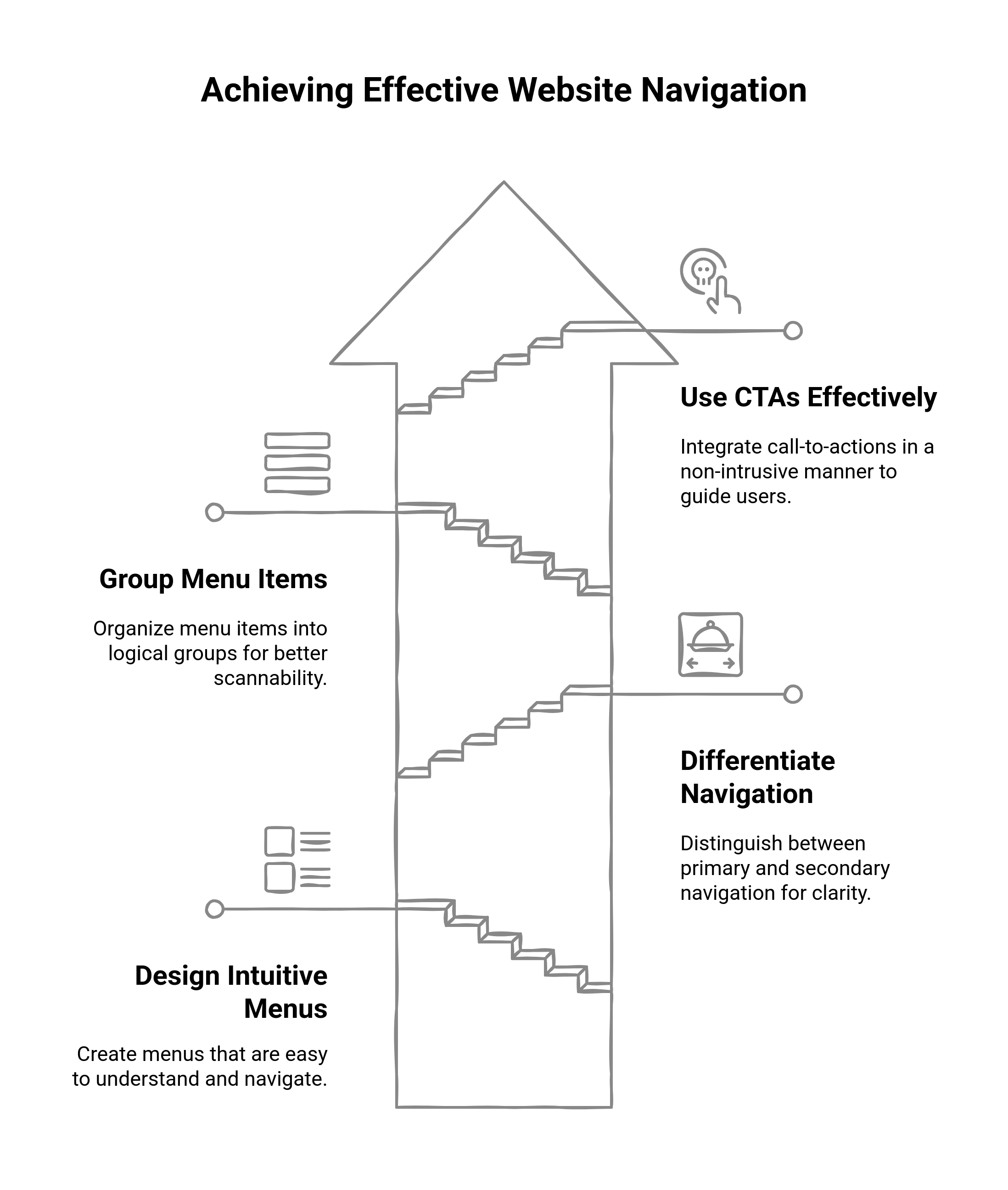
Identify what your users are actually trying to do on your site. Are they looking to compare plans? Read case studies? Schedule a demo? The primary navigation should reflect the top 4-6 user goals. Do not build around your internal team structures; build around journeys, not departments. Keep it shallow, not deep. No user should be more than two clicks away from any significant page. And avoid cute or clever naming conventions; labels should make sense in under a second. Clarity trumps creativity always.
What to Include in Primary vs. Secondary Navigation
In the principal navigation must be included the most mission-critical pages that drive action:
Product or Services
Price or Plan
About or Company Page
Contact / Book-a-Demo Button
Resource or Blog (if it is a very strong conversion path).
Supporting or secondary navigation, often found in the footer or header bar, can include pages such as:
Careers
Legal or Privacy Policy
Login / Account Access
Support or Help Center.
Do not consider all pages of equal importance. The primary nav is about making something happen; the secondary nav is about assisting or giving credibility.
Organizing and Naming Items on Menus for Scannability
Users are not reading menus, they are rather scanning. Group related items, and create an effective visual style (through spacing, font weight, subtle dividers) to distinguish sections. To create a block include “Features,” “Pricing,” and “Solutions,” put “Resources” and “Blog” on another block. Label items based on intent. “Use Cases” is vague—“Solutions for Teams” is better. “Services” is generic—“What We Do” or “How We Help” gives context. Each word should do a job.
Pro tip: Avoid burying too many items in dropdowns. If it resembles a sitemap, it's too much.
Use CTAs in Navigation Without Being Intrusive
A high-performing menu should include a big, action-oriented Call to Action, but only one. Examples of Common:
“Book a Demo”
“Start Free Trial”
“Get a Quote”
It should stand out from all the other menu items (button-style in a contrasting color) and be at the very far right of a horizontal navigation or at the end of a mobile menu. Keep it consistent across pages, so it becomes muscle memory for returning users.
What to avoid: Stuffing three CTAs into your menu or making every menu item a sales pitch. That's not navigation, it's desperation.
How to Use Visual Hierarchy in Website Navigation
Visual hierarchy is not just a design principle; rather, it is the control of attention. In navigation design, hierarchy helps the user instantly recognize what is important, what is related, and where to go next. When applied effectively, it allows an effortless flow, while its neglect accommodates confusion and misclicks. It takes less than a second for a user to make a decision based on visual cues, and therefore, each pixel must have a purpose.

Attentive and Flow-Driven Design
Intention is the first step. What would your users notice first? Natural eye movement starts at the top left corner (or, in mobiles, at the top center), so it is from there that the most important anchor points should belong. Create a directional flow, from broad categories through to specific CTAs, using order, sizing, and placement. The first-level menu items can be limited to avoid clutter. In this way, even when everything seems equally important, nothing stands out. These essential actions are to be highlighted by hierarchy, for example, your CTA button, and deprioritize secondary items-down in size and placement, for example.
Typography, Spacing, and Placement Techniques
Typography contributes toward scannability, an apt term for implementations that may be witnessed as obscure but are powerful. Sticking to consistent font families, vary the weight and size to make points. For example:
Main menu items: medium or bold, 16- 18px
Sub-menu items: regular weight, 14-16px
CTA button in nav: bold, slightly larger, often in all uppercase for urgency.
Ample spacing contributes to the readability of text by allowing for the "chunking" behavior of our brains that groups related information together. Provide ample ventilated space for all menu items, and use vertical or horizontal padding to separate groups. The placement of menu items is equally important. Sticky menus (that follow the user as they scroll) guarantee the availability of important action items. Do not forget not to eat much screen real estate, the goal should be compactness yet strong persistence.
Attentive and Flow-Driven Design
Intention is the first step. What would your users notice first? Natural eye movement starts at the top left corner (or, in mobiles, at the top center), so it is from there that the most important anchor points should belong. Create a directional flow, from broad categories through to specific CTAs, using order, sizing, and placement. The first-level menu items can be limited to avoid clutter. In this way, even when everything seems equally important, nothing stands out. These essential actions are to be highlighted by hierarchy, for example, your CTA button, and deprioritize secondary items-down in size and placement, for example.
Ways to Improve Navigation in Websites
Your site navigation can function, but that doesn't mean it's doing a good job. Time passes, and a site's navigation gets filled up with pages that are added after a while; categories multiply, and before you know it, your navigation feels like a junk drawer. However, the good news is that a total redesign is not required to achieve big results. Ingenious, strategic tweaks can transform your navigation into something sharper and more conversion-focused. Now, this is no glamour. It is reducing cognitive friction, focusing on user intent, and steering visitors toward whatever is most important. Let's walk through some high-impact stratagems you can employ to elevate your existing configuration.
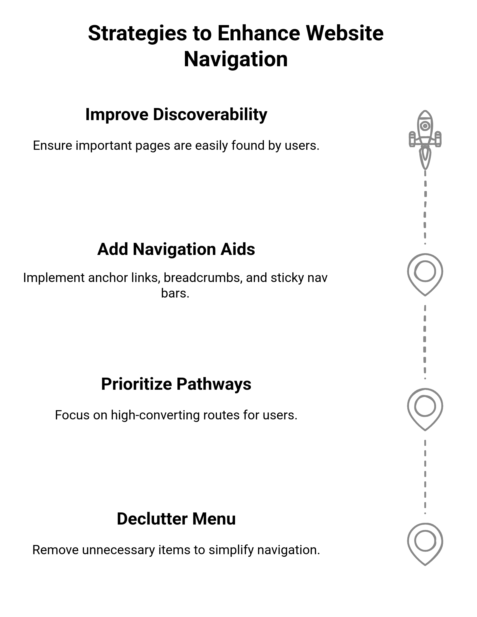
Decluttering Your Overloaded Menu
Review your navigation items first. Consider asking:
Does this page serve a primary user goal?
Is it critical to conversion, trust, or decision-making?
Can it be moved to the footer or combined with another page?
Remove anything that really doesn't serve its purpose. Five clear, focused options are preferable to an unwieldy 15-item list that overwhelms. Also, group related content under big categories with dropdowns or mega menus—this gives access while not creating confusion.
Prioritize High-Converting Pathways
Not every page deserves top billing. Analytics should tell you which pages directly affect conversions (think pricing, product features, case studies, demo pages), and these pages should be readily accessible (preferably within one click from the homepage). Put high-converting link locations in the main menu (top-left or top-right), and be sure that the call-to-action button (e.g., "Start Free Trial," "Book a Demo") is visually distinguished. Use internal links to connect lower-priority content (like blogs or FAQs) back to higher-intent pathways.
Adding Anchor Tags, Breadcrumbs, and Sticky Nav Bars
Anchor Links: A boon for long-form or landing page content. They allow users to navigate to the information they want, without an eternity of scrolling done.
Breadcrumbs: Perfect for deep hierarchical sites (like eCommerce or content libraries). They show users where they are and how to get back-essential for orientation and reducing bounces.
Sticky Nav Bars: The major navigation or calls to action remain visible to the user as they scroll. This is especially effective on content-rich pages, where users may be poised to act halfway down.
Implementing even one will help the user to navigate with confidence and less frustration.
Enhancing the Visibility of Critical Pages
If users don't discover those pivotal pages, they can't convert. To discover important content:
Include contextual links within high-traffic pages. (like blogs to pricing)
Use heatmaps to see where users hover or scroll-and adjust the design accordingly.
Feature key pages on your homepage, footer, and internal sidebars.
Also, do not underestimate the power of descriptive labels. "Resources," for example, could be renamed to "Customer Stories" or "Guides & Playbooks" for discovery purposes.
How to Balance SEO and UX in Website Navigation
SEO has long been at odds with UX, but a clever design of navigation does not have to make you choose between the two. An ideal navigation structure works for the users and helps boost the visibility of the site in search. The trick here is to consider navigation as a strategic layer, intuitively linking content for users while logically linking it for search engines. Insert the right navigation into your internal linking strategy to assist search bots in crawling your site effectively, thereby reinforcing keyword topic relevance in a way that does not seem spammy or unnatural to the user.
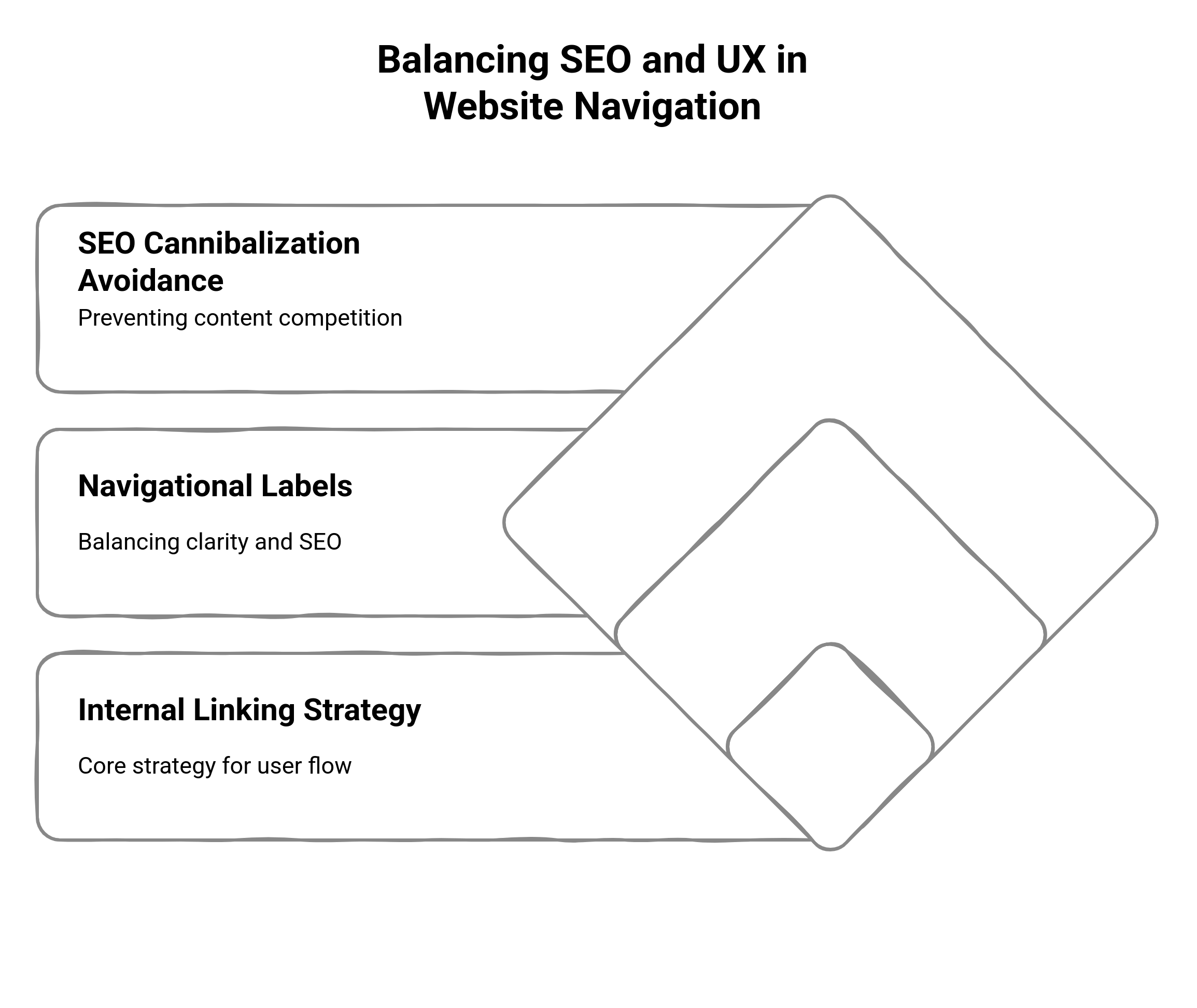
Navigating Your Internal Linking Strategy
Your navigation is one of the most formidable internal linking tools in your arsenal. It tells users and search engines alike what pages matter, and how they relate to each other. Best Practices:
Link from the main nav to your most important, highest-converting pages.
Create a grouping of related content under dropdowns or mega menus that give topical reinforcement.
Employ footer navigation to support long-tail internal linking (especially for SEO-heavy content such as blog categories or product subpages).
And this structure not only enhances crawl depth but also improves the distribution of page authority throughout your site.
Navigational Labels vs. Keyword Targeting
It may seem easy to fill up your menu with high-volume keywords, but if that confuses users, it backfires. The navigational labels should always opt for clarity over keyword density. That said, one can still approach it strategically. For instance:
Where feasible, replace hazy headers with tangible descriptors (e.g., "Marketing Automation Tools" instead of "Solutions" or "Software for Enterprise CRM"/"Software for Enterprise CRM").
"Don't use branded jargon in primary navigation unless it's already known to your audience."
Descriptive, search-aligned anchor text should be used where relevant (especially in dropdowns or footer navs).
In this way, your site menu will become a natural bolstering feature of your SEO strategy, rather than a clunky keyword silo.
Avoiding SEO Cannibalization Through Smart Nav Hierarchy
Navigation structures degrade the quality of keyword cannibalization when multiple pages compete for the same terms and dilute your rankings. A clear hierarchical navigation structure can prevent this by:
Assigning core pages per topic (one main Pricing page) rather than having three scattered subpages.
Using sub-navigation or breadcrumb paths to point to topical relationships.
Avoiding redundant links to similar content in the main nav.
Each primary nav should represent a unique keyword theme, while dropdown and subnav items would drill deeper down into associated subtopics. This creates a semantic structure for search engines and a clean site architecture.
Examples of Navigation That Boost Conversion Rates
A well-designed navigation system doesn’t just improve usability—it actively drives business outcomes. The following real-world examples from leading SaaS and B2B websites show how strategic navigation design directly supports user journeys and boosts conversions. These companies didn’t just guess what users needed—they built navigational experiences that aligned perfectly with user intent.
Calendly — Simplifying the Path to Action
Navigation Approach: Calendly’s redesigned navigation stripped away the excess and focused on the essentials: “Sign Up,” “Pricing,” and “Product Features” are front and center in the top menu. This clarity ensures that visitors immediately see the most relevant next steps without distraction.
Conversion Results: Following the update, Calendly reported a significant increase in user engagement and conversion rates. By reducing decision fatigue and highlighting high-intent pages, the navigation began functioning as a seamless guide toward signup and product exploration.
Slack — Clean, Minimal, and Intent-Driven
Navigation Approach: Slack opts for a minimalist top bar with straightforward links: “Product,” “Pricing,” “Enterprise,” and “Sign In.” There are no distractions or deep menus—just a clean interface that prioritizes clarity and speed.
Conversion Impact: This simplicity helps users, especially business decision-makers, immediately locate what they’re looking for. The frictionless experience leads to faster evaluation, lower bounce rates, and more sign-ups from both individuals and enterprise teams.
HubSpot — Scalable Yet Focused Navigation
Navigation Approach: HubSpot’s horizontal menu features well-organized categories like “Software,” “Pricing,” “Resources,” and “Contact Sales.” Dropdowns support content depth, while persistent CTAs like “Start Free” and “Get a Demo” are visually distinct and always accessible.
Conversion Benefit: This structure balances complexity with usability. It accommodates diverse user needs—from SMBs to enterprises—while keeping primary conversion points in plain view. The result: more qualified leads flowing through product pages and contact forms.
Conclusion
Website navigation isn’t just about helping users find their way around—it’s about guiding them toward action. When done strategically, your navigation becomes an invisible driver of conversions, shaping user behavior, reinforcing trust, and making the path from first click to final decision feel effortless. From understanding layout patterns and applying visual hierarchy, to decluttering menus and aligning UX with SEO, every navigation choice sends a signal. It tells your visitors what matters, where to go next, and whether they should stay or bounce. The best navigation structures do this seamlessly, often without users even realizing they’ve been guided. If there’s one takeaway from this guide, it’s this: don’t let your navigation be an afterthought. Revisit it regularly. Audit it ruthlessly. Design it with intention. Because when you treat navigation as a strategic asset—not just a design element—you unlock its full potential to support user experience, build momentum, and drive real business results.