Introduction
If you've ever hesitated to press a button for some time now, wondered what the form field was seeking from you, or felt unsure of what step to take next on the website, then you have experienced a lack or failure of microcopy. In B2B digital experience, 'clarity' is a must-it is the unspoken salesperson. Microcopy is tiny and powerful in terms of its effect on conversions, user confidence, and perception. Yet this is one of the most underrated tools in a marketer's entire toolbox.
So what is microcopy? Let's clear it up. Microcopy is more than just catchy button text or a witty tooltip. It's the deliberate placement of small snippets of contextual copy that help lead the visitor through tasks, lessen friction, and impart emotional clarity. Whether it is an error message or inline form hints, microcopy exists in all those subtle spaces that exist between decision and doubt. At its very best, ux microcopy will anticipate questions before they would even be asked-and deliver precise answers.
As user expectations sharpen and the buying journey becomes more fragmented, it is microcopy UX that remains the quiet champion in successful digital design. The blog will bring to light the meaning of microcopy with real-life elements, best practices, personalization strategies, and testing frameworks that will transform a passive audience into one that acts confidently. Whether you are a UX writer, a CRO expert, or even a B2B marketer, this is the time to write a microcopy that not just informs, but performs.
What is Microcopy and Why It Matters in Web Experiences?
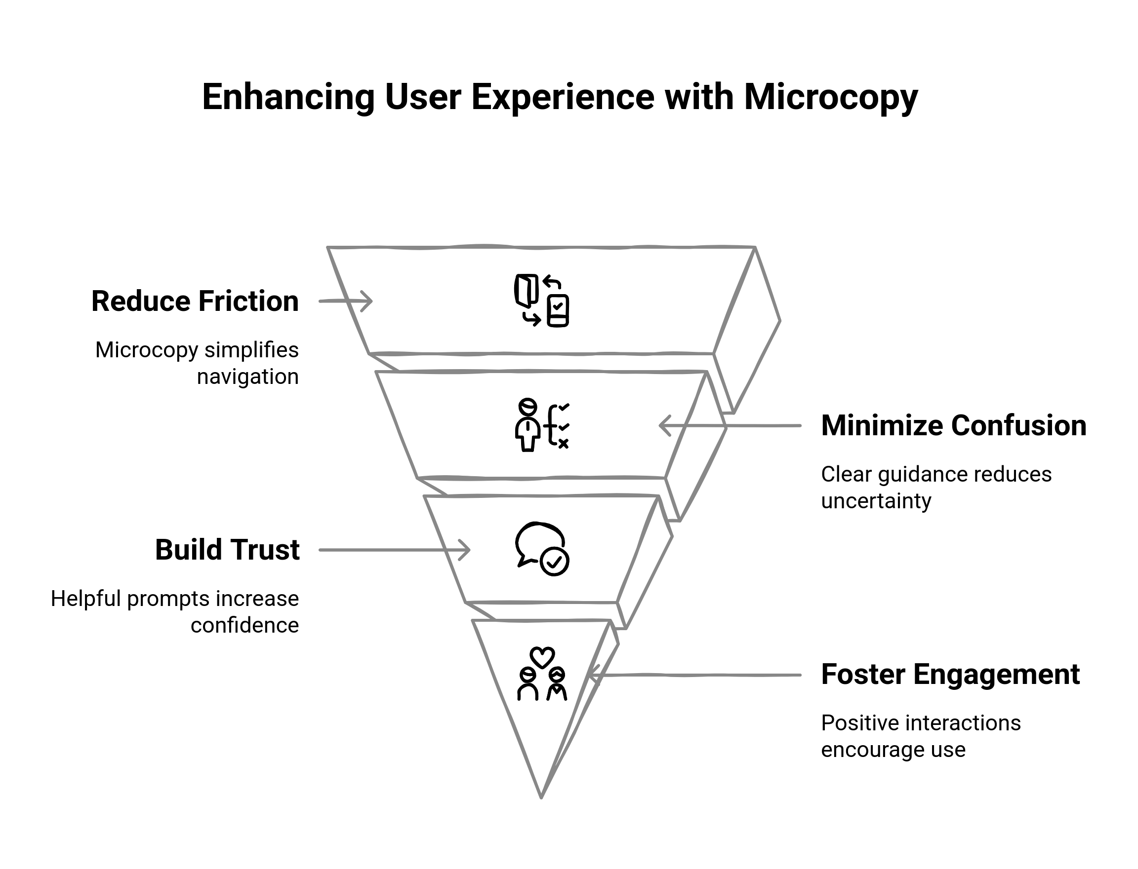
Users today, in such a fast-paced digital world, do not bother reading; they scan. Thus, microcopy is essential in taking website visitors through your product or service while not overwhelming them. This section will simplify the microcopy definition, its location on your site, and how it silently influences behavior, trust, and eventually conversions. If you are confused about what microcopy is and why it underpins contemporary UX, hold it right here.
Understanding the Microcopy Definition
Basically, microcopy is the tiny, functional bits of text that help the users take action, understand a task, or make a decision while they work on their way through a website or digital product. Not these:
- Button labels and CTAs (e.g., "Get My Demo" vs. "Submit")
- Placeholder text and form hints
- Error messages and success confirmations
- Navigation labels and tooltips
- Empty state explanations and onboarding clues
Not even anything close to that means that microcopy goes beyond the above. Perhaps even within functionality, what makes microcopy truly valuable is that it is a guide frozen in silence. In between gaps in the user's mind as they travel through your site, it offers just enough context to lower uncertainty. And for high-consideration B2B journeys, where every click counts, that clarity can make or break a conversion.
How Microcopy shapes Behavior and builds Trust
Microcopy influences behavior and nurtures trust among users. An effective UX microcopy alleviates tensions at those crucial touchpoints in a user's journey, right from when signing up to second-guessing the pricing page. Good microcopy works to assuage doubts and answer unexpressed questions while propelling visitors toward an informed decision.
Consider the difference between a plain form label such as "Company" and a hint that states, "Enter your company's full legal name for verification." This creates much more specific intent while also building trust that your brand cares about user accuracy and success.
The use of microcopy being humane and empathetic, and expecting a little emotional hesitation goes a long way in building a rapport with the user. Therefore, microcopies are not just another instructional tool; they also build relationships.
Why Microcopy Boosts Conversions and Engagement
Still on the fence? Here is what the data shows: Websites giving clarification to intent with their CTAs and error messages witness far lower bounce rates and better retention. In a study conducted by Yoast, microcopy changes led to an 11.3% increase in conversions
It's not just numbers; they are reminders that these bits of copy carry maximum weight. If you are looking to handle some real conversions, improve user flows, and craft intuitive user experiences, microcopy UX has to be your bread and butter.
How does Microcopy Influence Decision-Making and Visitor Navigation?
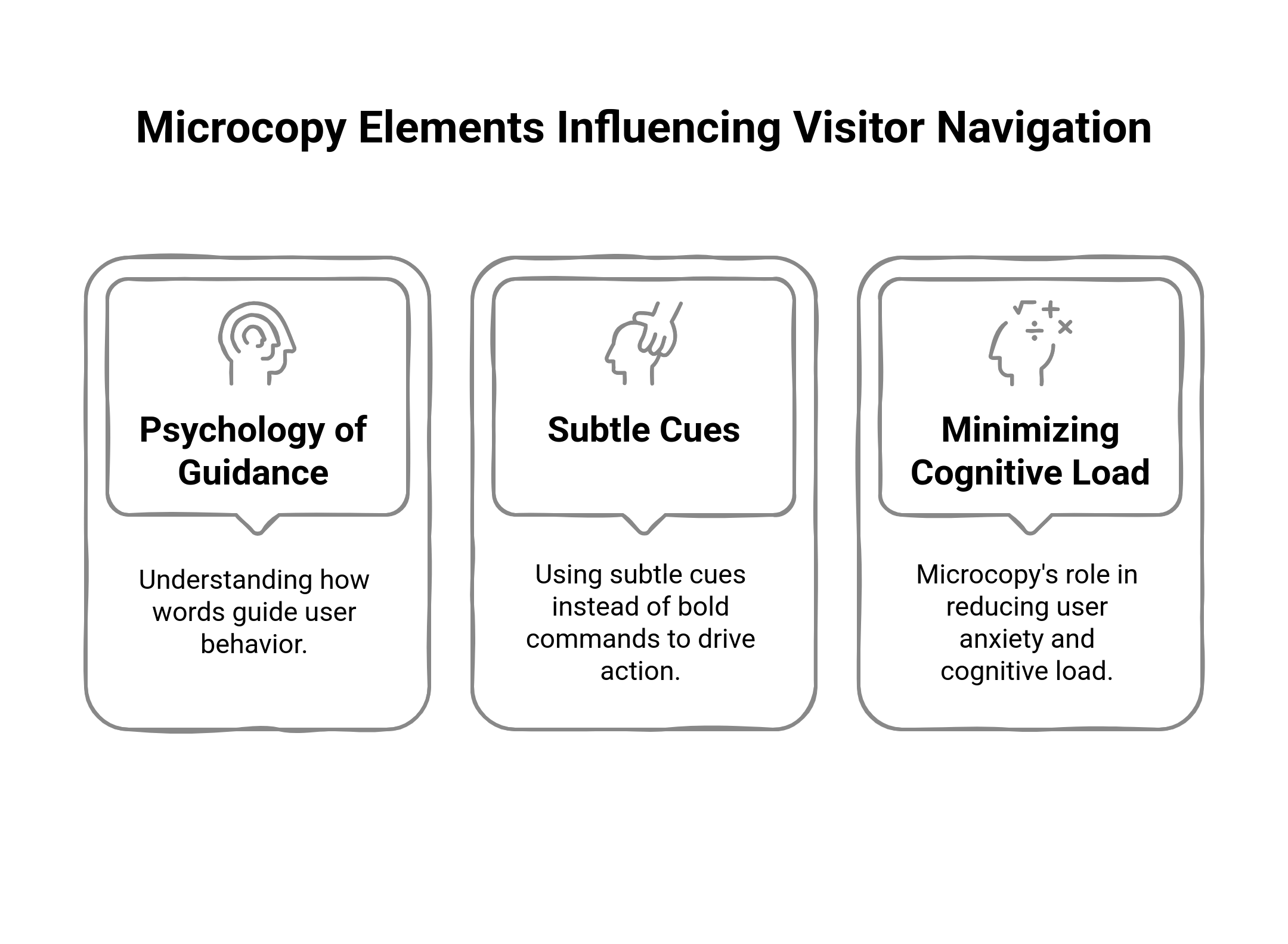
Microcopy does more than just provide information: it brings something new into consideration; it tries to persuade. This section will discuss how smart microcopy choices can influence a website visitor's perception, action, and motion across a website. The study of interaction design psychology will show the benefits of subtle over strong approaches, and the effects of good microcopy in reducing user stress and cognitive friction. Knowing how these mechanisms work will allow you to create experiences that feel intuitive, personal, and trustworthy.
The Psychology Behind Microcopy UX
Clarity is a universal craving of the human brain. A moment of doubt will cause one to hesitate or simply abandon any course of action altogether. This is where microcopies offer a shortcut to the thought process. Whether offering reassurance ("You can cancel anytime") or clarifying expectations ("Takes less than 60 seconds"), ux microcopy caters to the emotional and psychological needs of users.
Good microcopy keeps the cognitive load low for the user's tasks, which entails a lot in the behavioral science of seamless digital experience. The less a website visitor would be compelled to think, the more he would act. Hence, every bit of copy--each tooltip, each label, and each error state--should not only be functional, but should also be calibrated psychologically.
Why Subtlety is Better than Force in Microcopy
Directly telling users what to do is different from gently ushering them along to a decision. In high-consideration B2B scenarios, being directive with a bold "Buy Now" or "Click Here" can seem quite pushy. Conversely, softer, more subtle microcopy, like "See how it works" or "Explore your options," keeps the momentum moving without provoking resistance.
Subtle microcopy can create an impression of choice, while still stealthily guiding action. Examples:
- "Need more info? Compare all plans side by side."
- "Not ready to talk? See how others like you solved this challenge."
These phrases boost the customer’s confidence while relieving a bit of the pressure of commitment. Instead of having the feeling that they were sold something, users felt like they were supported. That difference is paramount when establishing trust.
Reducing Cognitive Load and Anxiety in Visitors
Not all friction comes from bad UX design; much comes from uncertainty. Sometimes, users are stuck after they do not know what a click is going to lead to, what the meaning of a field is, or why something is being asked of them. Microcopy UX can help reduce anxiety in real time.
Anxiety-reducing microcopy examples:
- "We'll never share your email with anyone."
- "Passwords must be 8 characters long - no special characters required."
- "We use your industry to personalize your dashboard."
Each of these removes doubt before it can derail the journey. When users feel seen, informed, and in control, they're far more likely to move forward.
Put another way, the meaning of microcopy is not just usability but also emotional assurance. It serves as the invisible voice beside the user, saying: "Don't worry. You are doing this correctly."
Where should you place Microcopy across the Customer Journey?
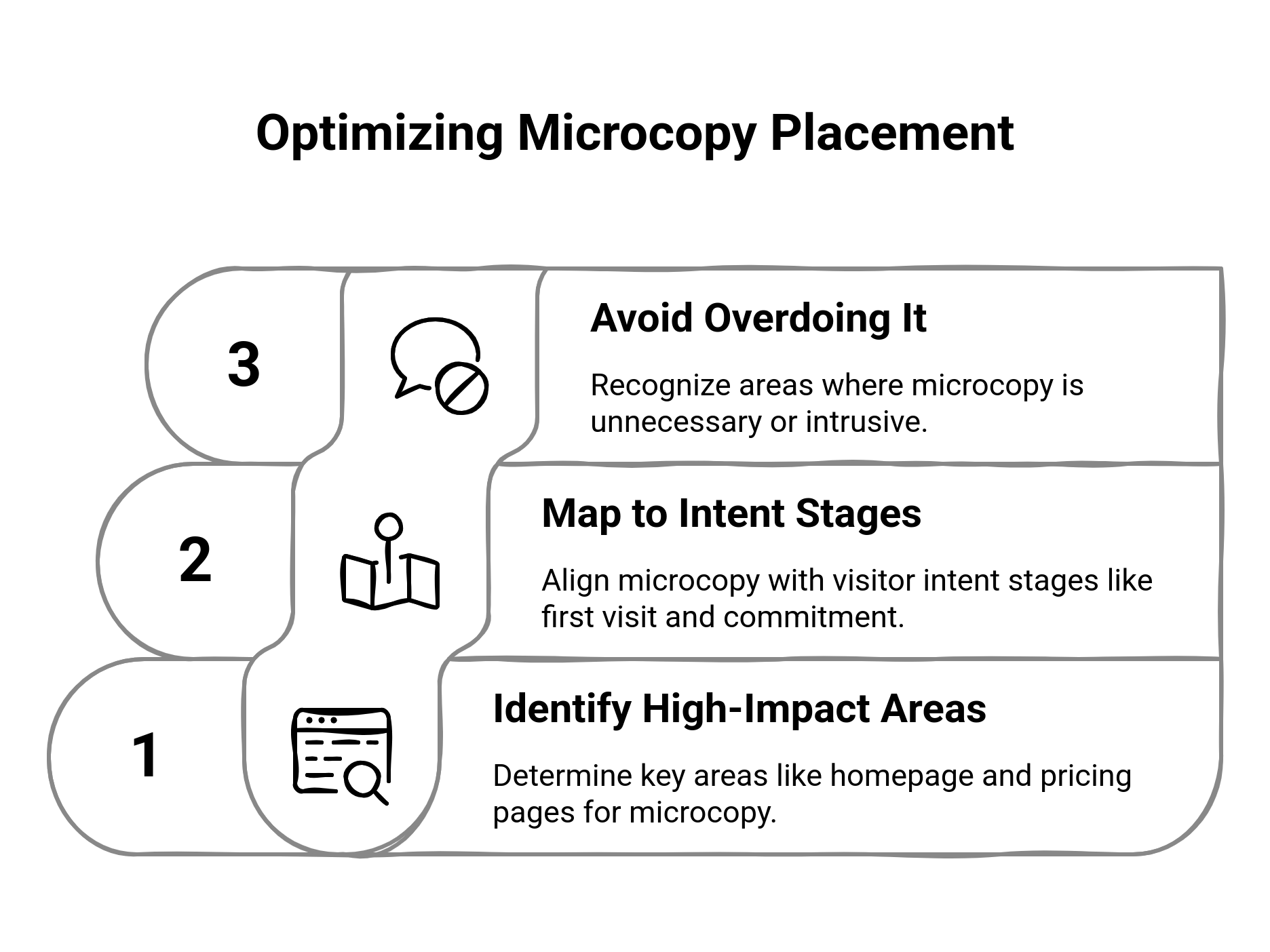
Writing microcopy is one thing; placing it correctly is what really makes for good UX. This section dives into the best locations in the customer journey to apply microcopy so one can make the very best of its use-from homepage scrolls to pricing hesitation to form abandonment. In those situations, the right words in the right place can ensure that website visitors are guided with surgical pinpoint accuracy. Not every pixel needs words, though; this is also where we indicate cases where microcopy should not be used and thus help you avoid overwhelming the audience.
Where Microcopy Delivers Its Best Results
Invisible is the best microcopy UX. It meets the user when friction or uncertainty occurs, and it helps them move forward. Critical touchpoints, microtexts at which one makes the biggest difference:
Homepage CTAs
Short, persuasive microcopy beneath buttons or sections can nudge new visitors toward key next steps. For example: "It takes less than 2 minutes to get started."
Pricing Pages
Those moments of hesitation are due to the users' confused understanding and anxiety about commitment, and with such microcopy like: “No hidden fees. Cancel anytime,” it can dissolve the tension.
Forms
The place where friction is most encountered. Inline hints such as "We'll use your phone only for urgent updates," or "Don't worry, no credit card's required yet" can drastically improve completion rates.
Onboarding and Product Tours
Through contextual microcopy, e.g., "Click here to create your first campaign—it'll only take a minute," uncertainty will be converted to momentum.
Empty States and Error Messages
When there's nothing on screen or something goes wrong, helpful microcopy reduces abandonment: “You haven’t created any segments yet. Here’s how to start.”
Nothing to the empty states and nothing or wrong-can-be-helpful microcopy to minimize abandonment: "You haven't created any segments yet. Here's how to start." At each of these points, the microcopy meaning goes to decrease hesitation and give the users enough clarity to proceed with a sense of confidence.
Mapping Microscopy to Different Stages of Intent
Not every passerby follows the same path of thought when entering your site. Your microcopy should therefore seamlessly match their different intent stages:
First-time visitors need orientation and reassurance. Use a microcopy that welcomes visitors, encourages them just to feel free about anything, and is light-hearted.
"Not sure yet? Take a product tour."
Evaluation-stage users need detail and clarity. You want microcopy that answers questions before they're even asked:
"Yes, we integrate with HubSpot, Salesforce, and Marketo."
High-intent or returning users want to feel certain: It's now or never. This is where microcopy can emphasize time-to-value:
"Most teams launch in under 3 days."
This mapping works with behavioral expectations to ensure your ux microcopy is doing the right job at the right time.
When to Avoid or Scale Down Microcopy
It is difficult not to want to speak to every corner of the site; however, excess microcopy would only serve as noise. When to refrain:
- Actions that are so obvious, such as "Download PDF," don’t need any further explanations
- Users being instructed too much could lead to the perception of being patronized
- High-density interfaces in need of white space more than words—do not go cluttering dashboards and navigation menus with copy that does not solve a problem
The rule basically is, if microcopy does not reduce friction, clarify a decision, or build trust, it does not belong.
What are the Best Practices for Writing Microcopy that Guides without Interrupting?
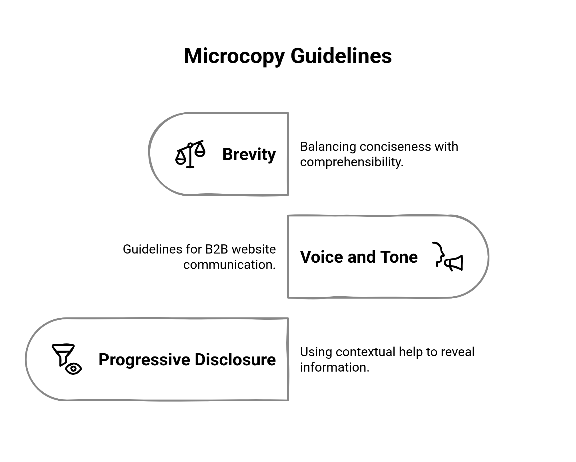
Good microcopy does not shout; it whispers with confidence and clarity when needed. This section talks about the underlying beneficial techniques applied in practice to write UX microcopy that actually aids the user without occupying their brain space. It discusses how to achieve the right equilibrium between brevity and clarity, how to choose the right tone for the B2B audience, and how to implement contextual help through progressive disclosure. If you want to really guide your website visitors well, this is where the strategy meets the keystone.
Brevity with Clarity: The Less Said, the Better?
In microcopy UX, every word earns its position. It's almost like a cardinal sin to state something in fewer than a certain number of words and yet be clear. Being too descriptive is just as bad as being incomprehensible. Check it out:
- Incorrect: “Submit”
- Right: “Request Your Demo”
Short, yet all the information is present -- it tells the user what they have to look forward to, rather than what they are doing. Here's another one:
- Incorrect: “Try”
- Correct: “Try It Free for 14 Days”
Strong microcopy crystallizes value and intent without forcing the user to strain to interpret it. In fact, a good rule of thumb is that when it gets too short, a user may hesitate or ponder, “What does this really mean?"
Voice, Tone, and Word Choice for B2B Websites
In the B2B sector, microcopy must do more than just guide; it must build credibility. The right tone is confident, helpful, and human, without being informal or robotic. Here's how you can strike that balance:
Be direct, not dry
Example: “Need help choosing a plan? Compare all options here.” (vs. “Explore our extensive pricing matrix.”)
Use plain language
Trade jargon for clarity: “Your data stays private” outperforms “We follow GDPR compliance best practices.”
Match the moment
Confirmation message? Friendly and reassuring. Form field?
Clear and factual
Tailoring tone by context keeps UX microcopy feeling intuitive and natural.
And remember: in B2B, trust is currency. Every tooltip, CTA, and hint is an opportunity to show professionalism and empathy.
With Progressive Disclosure and Contextual Help
The user does not need to understand everything upfront—help needs to be given at the right moment. Here is where progressive disclosure becomes useful. The right microcopy reduces complexity only when it is really needed, preventing an overload of users with too much content. Some examples:
- Tooltips: “What’s a segment?” → Hover reveals: “A group of users defined by shared behavior or traits.”
- Inline help: “Why do we ask for your industry?” → Click reveals: “To personalize your onboarding dashboard.”
- Expandable FAQs or “Learn more” links: Keeping the interface clean while not overwhelming support for those who need it.
This system not only cleans up the interface but also encourages the website visitors to build their confidence by exploring at their own pace. It ties in nicely with the deeper meaning of microcopy: not to control the user's experience but to support it.
How can Personalization work to improve the Effectiveness of Microcopy?
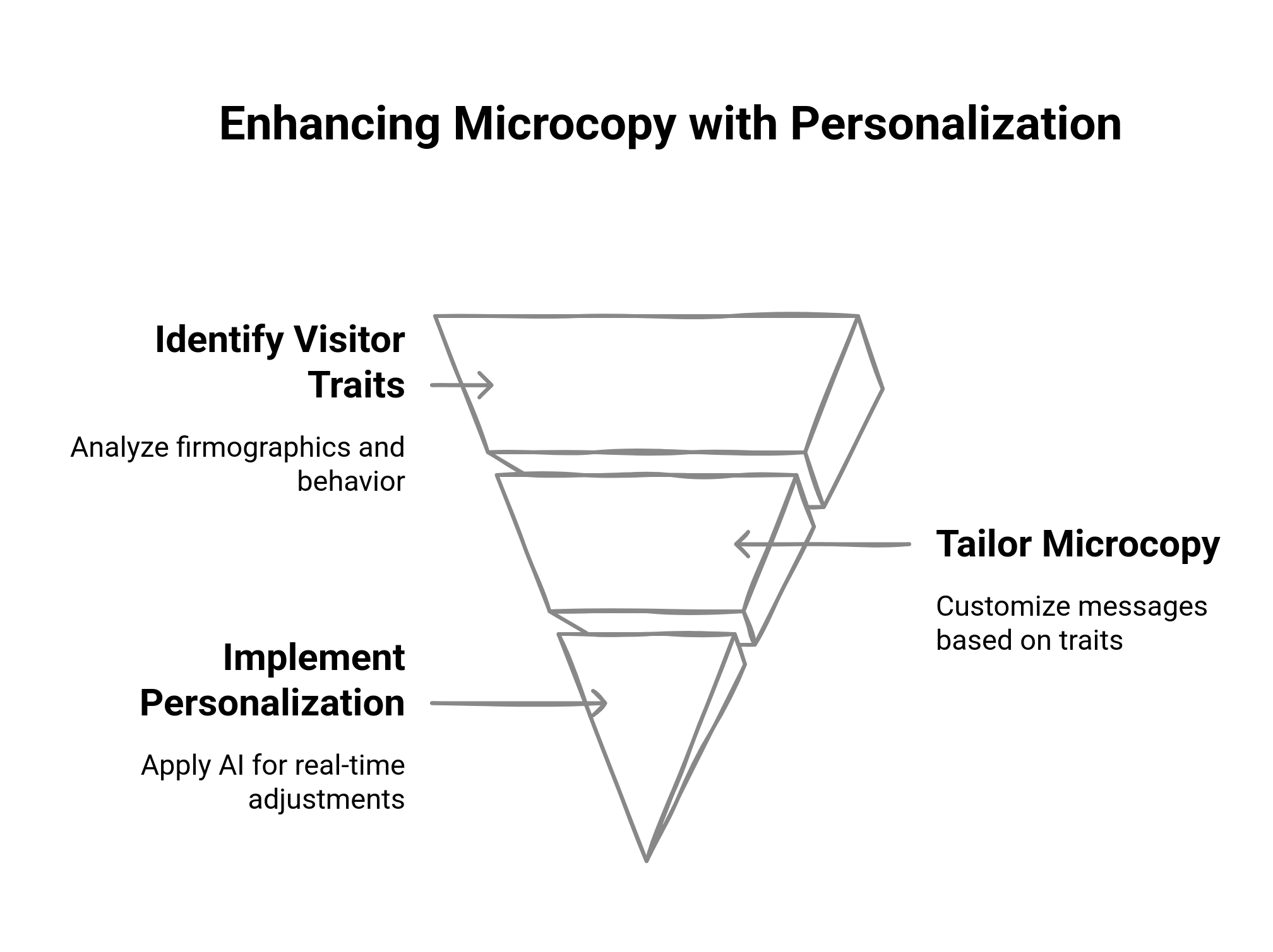
Microcopy, at its best, does more than just direct; it deepens that emotional connection by personalizing itself to who the user is, where they are coming from, and what they are concerned about. This section explores how a personalized microcopy UX can lead to increased engagement, fewer drop-offs, and higher conversion rates. From firmographic targeting to real-time AI-driven tuning, personalization gives a strategic edge to the tiniest (but arguably most impactful) words on your website.
Dynamic Microcopy: Tailoring by Firmographics, Behavior, and Source
Generic microcopy gets you going, but it's the dynamic custom microcopy that really makes an impact. Depending on firmographic data (such as company size, industry, or job title), behavior (such as return vs. first-time visitor), or contextual insight from the source (i.e., ad, email, direct visit), you can come up with Ux microcopy that feels made to measure. Examples:
A returning visitor from the healthcare industry sees: "Explore how top hospitals personalize patient journeys."
A CIO from a SaaS company who landed via LinkedIn sees: "See how finance leaders cut CAC using real-time insights."
For a first-time visitor who clicks through from a Google ad: "Here is what you can expect in your first seven days — no obligation."
Each variation carries with it the meaning of the microcopy: Clear, Relevant, Driving momentum.
Geo-Specific and Industry-Specific Microcopy at Work
Contextual microcopy does not stop at intent; it can be reflective of location, regulation, or regional expectations. Geo-personalization helps elicit immediate trust and reduce perceived friction. Examples:
For a visitor from the UK: "Free delivery anywhere in the UK — no VAT surprises."
For a banking executive in Canada: "Compliant with Canadian financial privacy laws."
For an enterprise prospect in the pharmaceutical industry: "HIPAA-ready, fully on-premise deployment available."
In every instance, microcopy UX aligns with regional and industry expectations to reduce anxiety and build credibility.
When to Use AI-Enabled Personalization in Microcopy
It isn't a real breakthrough if microcopy has no ability to evolve in real time. Artificial intelligence-based personalization engines such as Fragmatic use behavioral signals, historical information, and traffic sources to deliver adaptive microcopy with no manual interference whatsoever. Examples of AI-personalized microscopy:
On a pricing page: "Most companies your size choose the Pro Plan."
In a form field: "Your colleagues at Acme Corp signed up last week."
Next to a CTA: "Only 2 more seats available for your team."
These aren't nice-to-have additions; they massively increase engagement. According to internal benchmarks from Fragmatic, personalized microcopy increases CTA click-throughs by up to 41%, more so in conjunction with behavior-triggered nudges.
If you want your site to adapt like a great salesperson - listening, contextualizing, responding - personalized microcopy is your most scalable ammunition.
What are Common Microcopy Mistakes that confuse or mislead visitors?
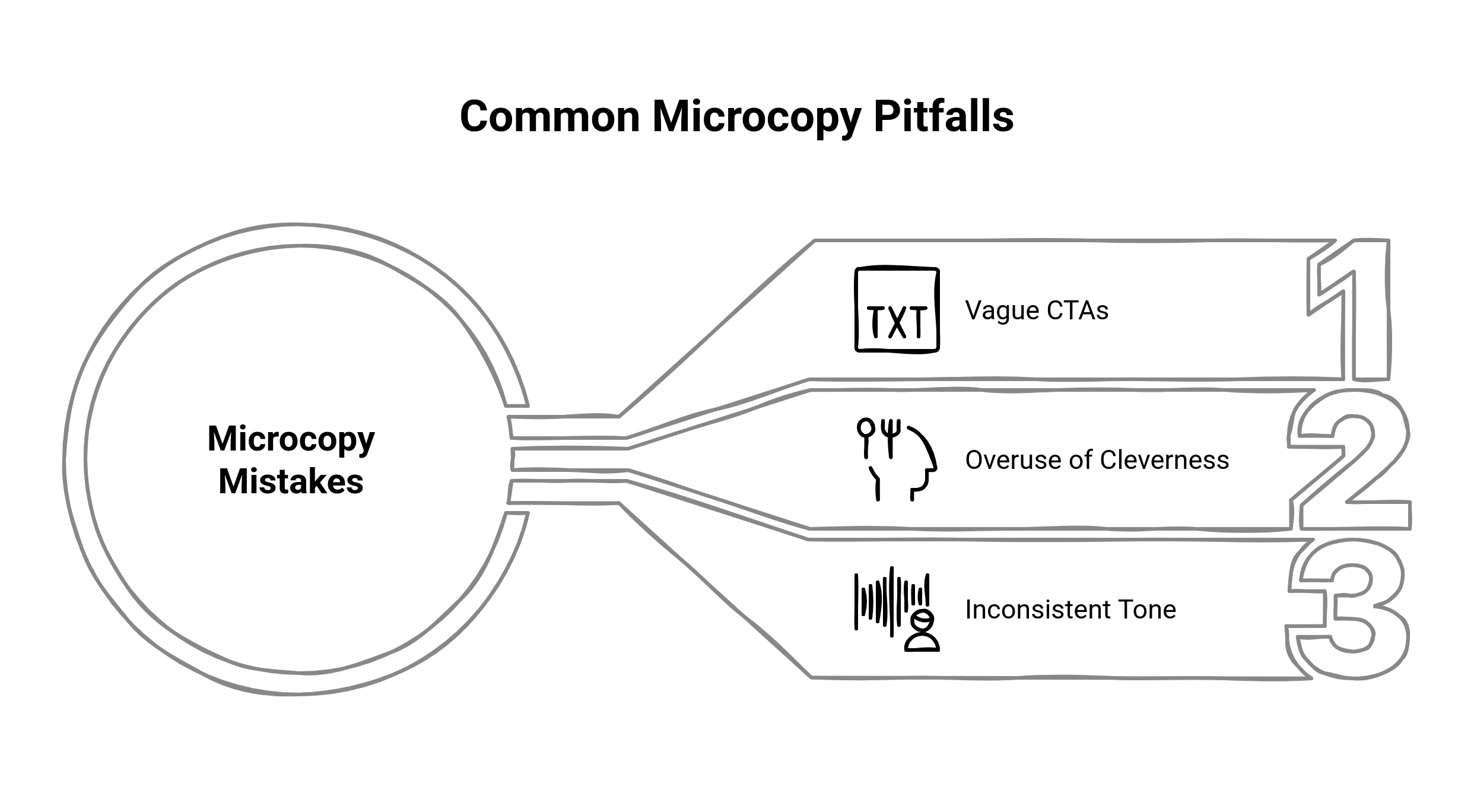
With all its power, microcopy is more likely to fail if used wrongly when vague, inconsistent, or trying too hard to be funny. This segment analyzes the most common ux pitfalls of microcopy that annoy or mislead website visitors and gives really down-to-earth solutions on how to avoid them. Puny call-to-action, a puzzling error message, or a tone that is not quite on-brand — bad microcopy does not just miss the boat; it hampers conversions and erodes trust.
Vague CTAs that Leave Visitors Guessing
One of the more common microcopy mistakes? A CTA that doesn't actually say what happens next. A button that just says "Submit" or "Click Here" doesn't let users know what is going to happen afterward. It allows a moment of hesitation — that microsecond of doubt adds up awfully quickly in your funnel. The better option would be:
"Submit" → "Request My Demo"
"Click Here" → "Download the Playbook"
"Continue" → "Review My Quote"
Strong microcopy tells you what, why, and sometimes even when. It carries intent, not vagueness.
Cleverness that Kills Clarity
Cleverness is very tempting for brand or product marketers. However, cleverness can be dangerous when it causes an interruption in understanding. If I now stop to understand a joke or metaphor that is in a tooltip, form label, or error state, I've introduced unnecessary cognitive load.
Examples of clever gone bad:
"Oh no! The gremlins are at it again." (Confused as to what happened and how I go about fixing it?)
"Let the good times roll!" (Vaguely, where is this party: what is it a confirmation for? For a signup?)
Instead, clear and concise — and inject personality only where it improves, not distracts.
Examples of smart clarity:
"The system couldn't process your request. Please try again, or contact support."
"Account created - now you can go ahead and explore your dashboard."
Always remember the true microcopy meaning-that removes friction, not adds spice just for the sake of it.
Tone Inconsistency across the Experience
Inconsistent tone is another silent killer in microcopy UX. While your homepage may sound bold and confident, your error messages are robotic, and your onboarding tips may be too casual. Such tonal whiplash destroys trust at a breakneck speed.
Solution to this:
Create a microcopy voice & tone guide that goes with your brand personality
Use tone mapping across the journey
Calm and reassuring during errors
Confident and helpful for pricing or product pages
Welcoming and warm during onboarding
Regular auditing of existing microcopy to catch off-brand phrasing
In such a B2B reality where trust and clarity are non-negotiable, a consistent tone is not just a branding issue; it is usability.
How can you Test and Optimize Microcopy for Better UX and Conversions?
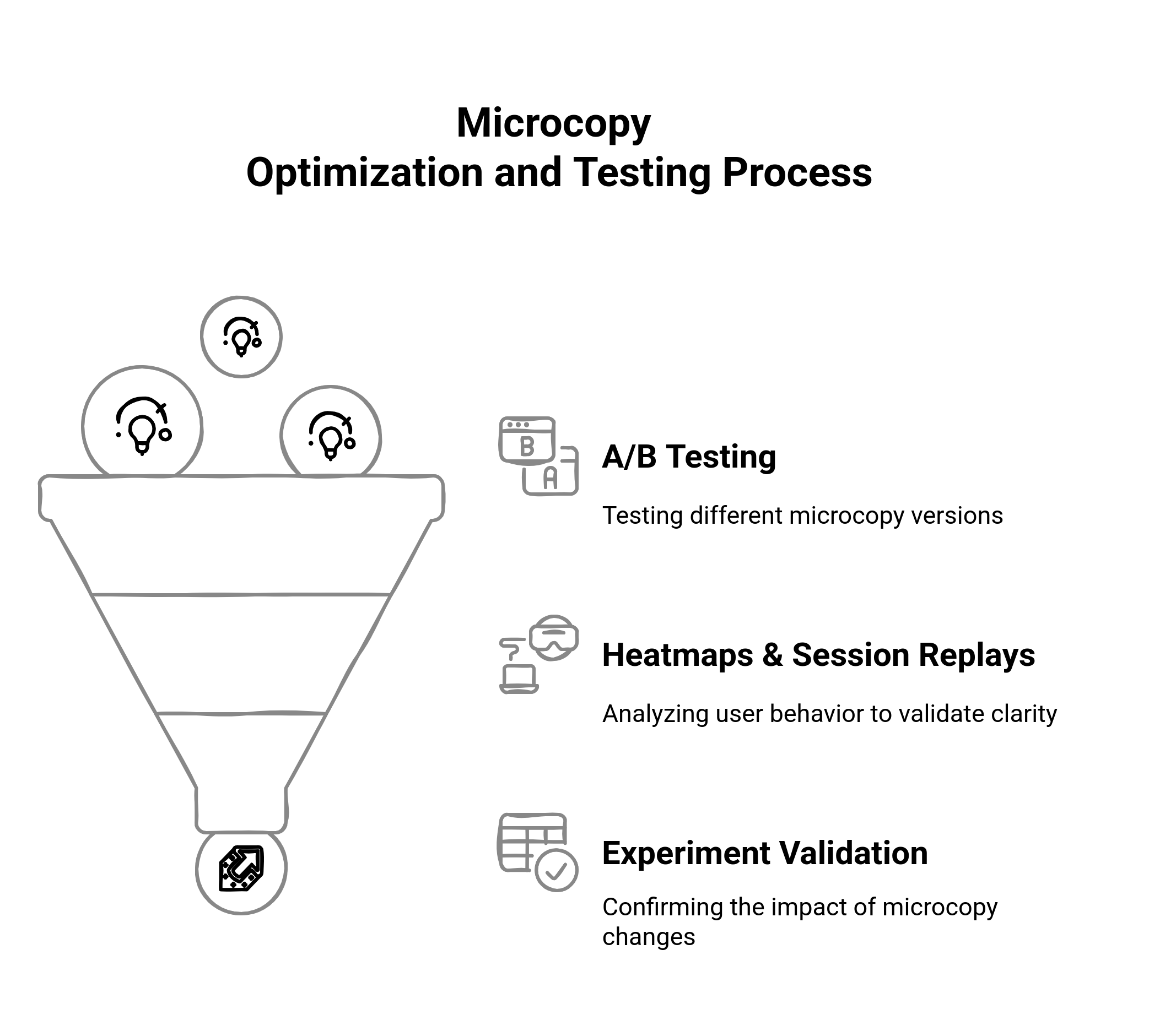
Great microcopy doesn't come about by chance-it is tested, tweaked, and supported by data. In this last section on tactics, we will explore how to systematically leverage A/B testing, behavior analytics, and live testing to improve your microcopy UX. You will learn what to test, how to measure the impact, and how slight word changes can lead to massive wins in clarity, engagement, and conversions.
Microcopy A/B Testing: What to Test and Why
Clueless about where to start? Test what's high-friction, highly visible, and high-impact. Microcopy A/B tests do not call for design changes. Merely change the words for better ones. Ideas to test:
CTA Button Labels
“Book Now” vs. “Schedule My Demo”
“Get Started” vs. “Start Free, No Credit Card”
Form Field Instructions
“Phone Number” vs. “For updates — we’ll never spam”
Tooltips and Inline Help
“Segments are user groups” vs. “Group visitors based on shared traits or behaviors”
Even subtle wording tweaks can change behavior. Test one variation at a time, measure clicks, hovers, and completions, and ensure that your testing duration captures enough traffic for statistical relevance.
Use Heatmaps and Session Recording to Validate Copy Clarity
Sometimes, users do not click because they do not understand. Here is where behavior analytics is the best. Tools like Hotjar, FullStory, and Smartlook will give you insight into where users hesitate, rage-click, or simply drift away on your website. How to use it:
Heatmaps show areas where users linger- are they interacting with your tooltip or CTA at all?
Scroll maps highlight microcopy being missed altogether.
Session recordings allow you to watch real visitors as they navigate- do they hover over unclear fields, backtrack, or skip onboarding instructions?
These insights can be used for fine-tuning the placement, visibility, and wording of your microcopy in areas such as forms, onboarding flows, pricing pages, and empty states.
Conclusion
The fast world of digital experience isn't a mere filler of microcopy but a multiplying force. The right words, in the right place, will eventually guide, reassure, and convert visitors of your website without friction or confusion. Every touchpoint-from form fields to CTAs, tooltips to empty states-is an opportunity to impart a bit more clarity, add a bit more trust. The microcopy meaning clearly indicates, with best practices, personalized to context and an active site audit, that you can change those words considered useless into the fuel for your high-impact UX. When language tends to be an extension of user intent, that's when microcopy makes the most powerful work. Treat ux microcopy as a strategy, not decoration in itself. Start optimizing with one word at a time.